Increasing property prices have spurred on owners to renovate and extend their homes. Catch-cry phrases, such as ‘light and bright’ are conveyed to both architects and interior designers in the hope that this measure will further inflate their ‘nest egg’. So ‘glass boxes’ get added to period homes (the easiest way to achieve light-filled interiors) and skylights are dotted through the place. The pictures go up, the flowers arrive, and everyone appears to be satisfied, particularly when the real estate agent gives a nod of approval. But is that all that’s required in designing a home? Shouldn’t there be some excitement, a certain adventurous spirit, where owners throw caution to the wind and request their designers capture their mood and spirit, rather than those of the agents?
Multiplicity is one architecture and design practice that isn’t afraid to offer something considerably more than a glass box to an existing home. One client, wanting to renovate and extend her house in Prahran, Melbourne, started the dialogue by requesting an outdoor laundry. “She didn’t like the smell of detergent or washing powder. She also didn’t feel the need to adhere to social norms,” says architect Tim O’Sullivan, co-director of the practice, who worked closely with his life and business partner, interior designer Sioux Clark.
The laundry in the Prahran house was located in the carport to the rear of the property. But rather than treat this as a rudimentary out house, it has been finely detailed in plywood. Multiplicity also reused the 1970s carpet, laid by the previous owners. The floral and Aztec patterned carpets were reworked on walls to reduce noise from hard surfaces, as well as adding texture and warmth. “Our client knew she would raise eyebrows from family and friends, but she went with our idea of incorporating the home’s history, once owned by a Greek family, into the mix,” says O’Sullivan. Other adventurous features in the home include a 1970s-style sunken conversation lounge, and thick gold velvet curtains in the dining area, orientated to the north and rear garden. “The gold curtains are quite specific, but the colour was a springboard for our client’s copper and brass sculptures,” says Clark.
As well as responding to the owner’s art collection, Multiplicity was mindful of providing as much attention to the back entrance as to the front door. “Our client regularly walks her dog and uses the back laneway,” says Clark, who from the outset of each briefing session, ask clients ‘how they live’, rather than how much capital gain they are hoping to achieve.
Kennedy Nolan Architects also regularly step outside the ‘safety zone’ when designing homes for clients. Their award-winning house, located in the Melbourne bayside suburb of West St. Kilda, saw the transformation of a single-storey Victorian terrace into a striking contemporary family home.
The original single-storey rooms at the front of the St.Kilda West house were reworked with a lowered floor to increase the ceiling height (approximately five metres). The dining area, which forms part of the new two-storey wing, features a piano-shaped void, with timber and glass walls creating an intimate ‘veil’ around this space. And to further add drama, the ensuite to the main bedroom, located directly above, features a translucent glass floor.
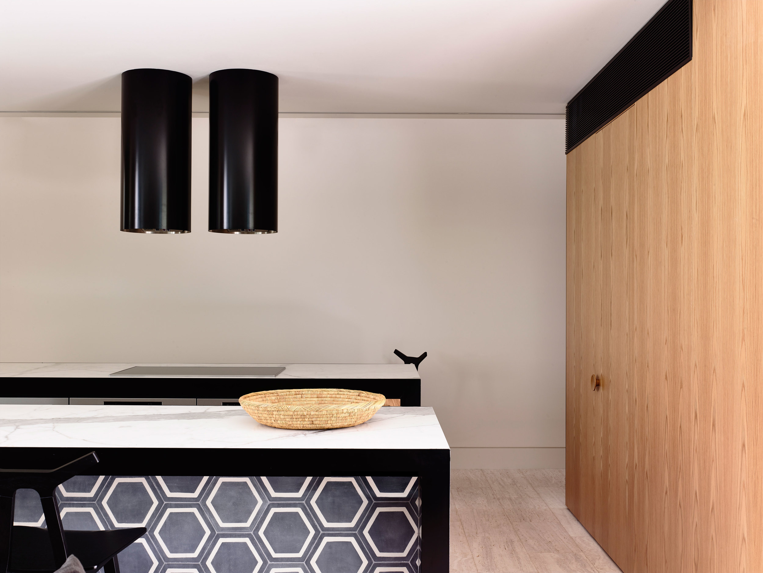
Designed for a family, one of the most striking features in the new wing is the black steel ‘hoods’ that filter the northern light. “We’ve also used some unusual forms and textures, as well as colour,” says architect Patrick Kennedy, who worked closely with co-director architect Rachel Nolan. “A house should capture the owners’ personalities, as well as reflect how they live, rather than how others think they should live,” says Kennedy, who sees part of the problem with design being the overvalued property market. “I think some people have a slightly warped idea of what their house is worth, treating it more like a trophy than a place they enjoy living in,” says Kennedy.
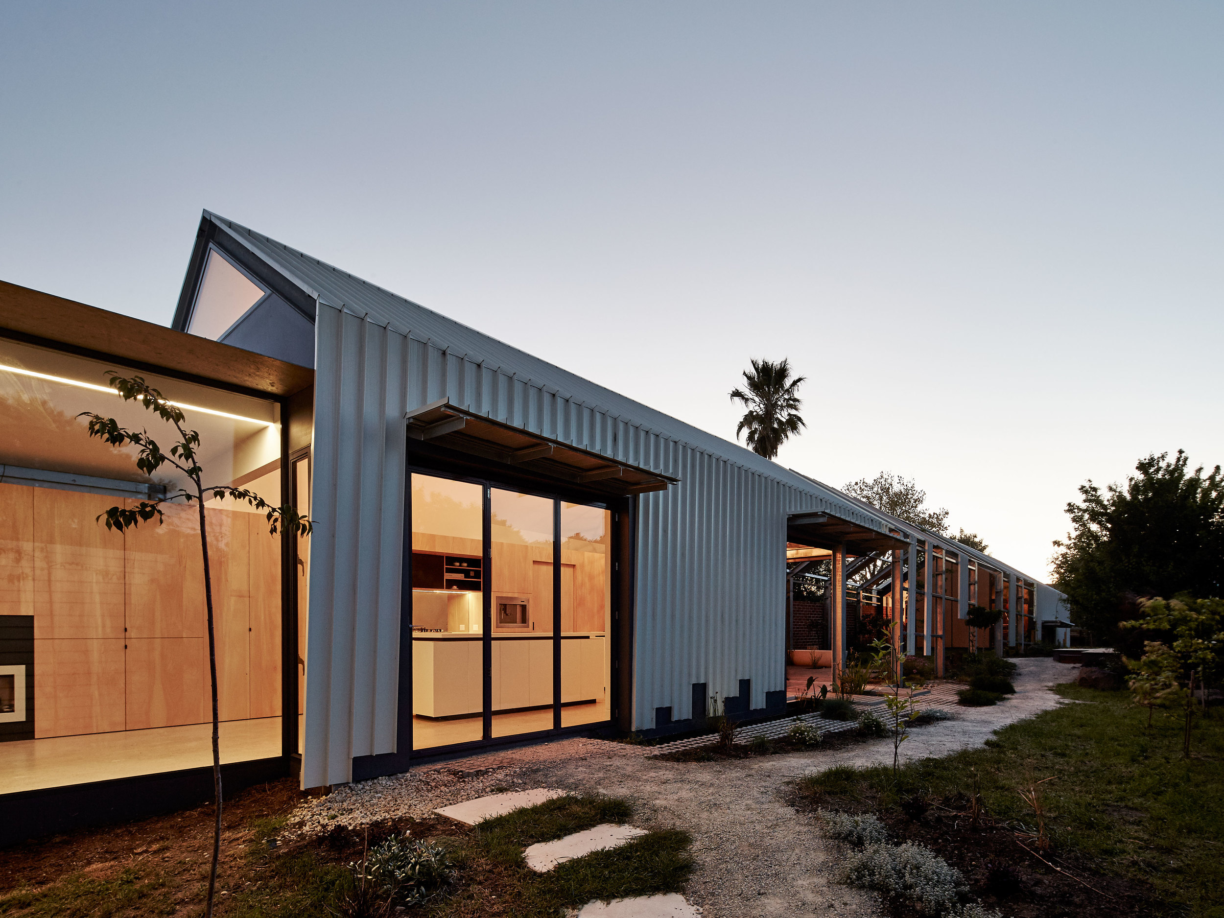
Architect Andrew Maynard regularly steps outside the norm when designing renovations or building new houses for his clients. One couple, who moved from an apartment into a house in Seddon in Melbourne’s inner-west, wanted the focus to be on the garden. “From memory, my client’s first words were ‘I want a ridiculous inside-out design,” says Maynard, who created an extension to their house that almost dissolves as it extends into the garden. The steel structure, loosely resembling a farm shed, is partially open to the sky. A freestanding bath is a centerpiece. Even on a cold day, the bath is filled with hot water and the owners literally feel as though they are part of the garden. As unusual is the main bedroom, with a sliding wall that allows it to form part of the kitchen and living areas. “Our clients don’t have children, so privacy isn’t an issue. This way they have unimpeded sight lines into the garden,” adds Maynard, who is fortunate to attract clients who want a home for themselves rather than purely for resale. “The last thing they want is to keep up with the Joneses.”
Text by Stephen Crafti


